Where does your money actually go each month? It’s a question most of us struggle to answer with precision. Sure, you might know rent is your biggest expense, but what about everything else? How much did dining out really cost you this quarter? Is your transportation spending creeping up?
Category Breakdown is Cashculator’s answer to these questions. It transforms your transaction data into interactive visual charts that reveal spending patterns you might never notice scrolling through lists. Let’s dive into how to use it. There’s a also a video tutorial, which you can watch below or on YouTube.
Opening Category Breakdown
- Open your Cashculator document.
- Go to the Reports screen.
- Select “Category Breakdown” from the available report types.
- Choose between Expenses or Income at the top of the screen.
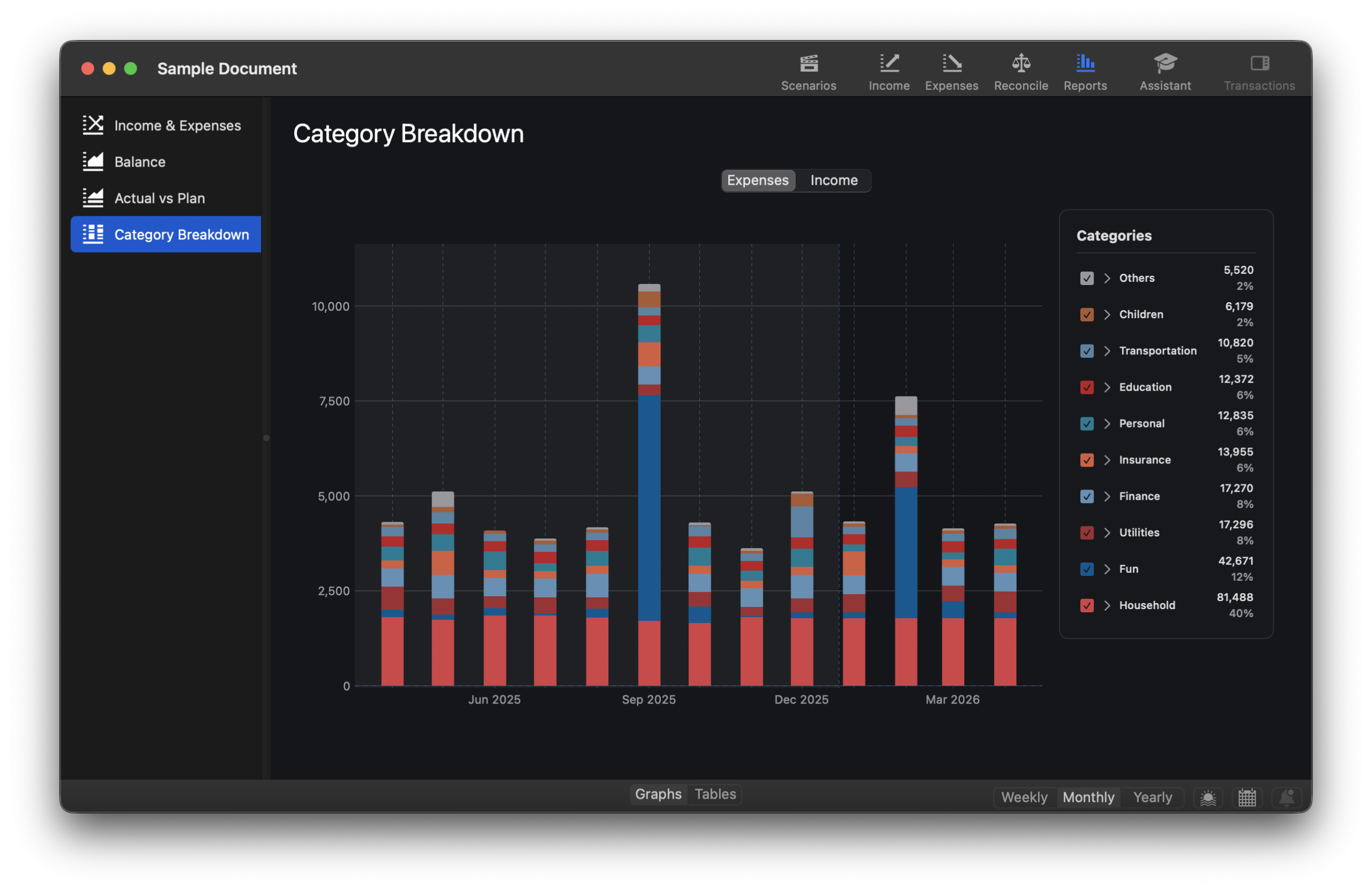
You’ll see a stacked bar chart where each bar represents a time period and each colored segment represents a category. The taller the segment, the more you spent. It’s that straightforward.

Understanding What You’re Looking At
The chart shows your top-level categories or category groups, with the nine largest displayed individually. Anything smaller gets grouped into “Others” at the top of each bar. But don’t worry, you can explore what’s inside “Others” with a single click.
The visual language is intuitive:
- Larger segments = bigger spending categories
- Position matters: heaviest categories (largest total amount over the whole period) sit at the bottom, closest to the baseline.
Hover your mouse over any segment to see a tooltip with the category name, exact amount, percentage of total, and date range covered.
The Table View
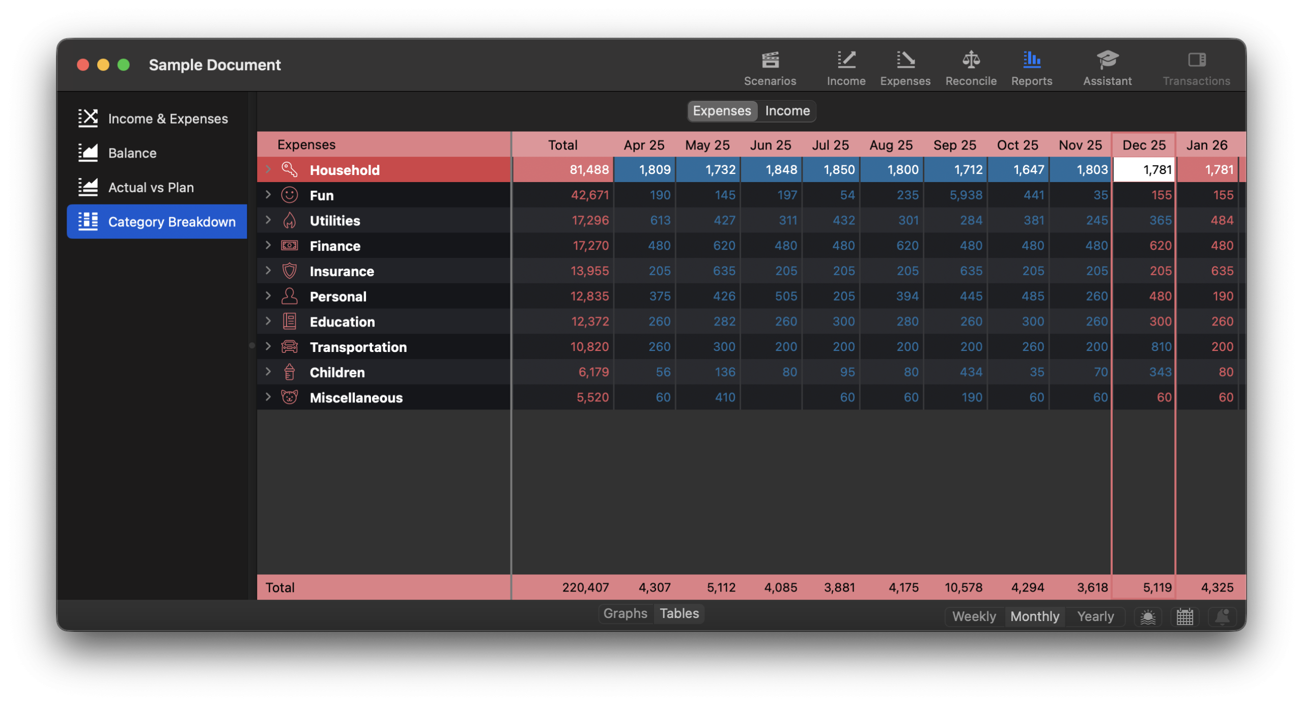
Prefer exact numbers to visual patterns? Click the table view to see the same data in spreadsheet format. Categories are sorted from highest to lowest total, so you immediately see where most of your money goes. It’s similar to Combined view in Income/Expenses screens but the categories are sorted and it shows totals for each row. It also behaves a bit differently with regards to navigating to subcategories.

The table includes:
- A Total column summing all amounts across your selected time period
- Individual columns for each week, month, or year
- Grand totals for each column at the bottom
Drilling Down: Where It Gets Interesting
Category Breakdown is an interactive tool. Let’s see how it works.
See the Transactions Behind the Numbers
Click any colored segment in the chart to see the top ten transactions that make up that category for that time period. In the table view, double-click any cell or select it and press Space to see all transactions.
This is incredibly useful for investigating anomalies. Noticed your “Fun” category spiked in June? Click on it and discover that planned summer vacation drives the total.
Explore Category Groups
Have you organized categories into groups like “Transportation” containing “Fuel,” “Public Transit,” and “Car Maintenance”? Double-click the group name (or click the arrow next to it) to break it down into its component categories.
Breadcrumbs at the top track your navigation, you’ll see something like “Expenses › Transportation.” Press ⌘↑ or click the home icon to return to the top level anytime.
What’s Hiding in “Others”?
The “Others” category often holds surprises. Click the arrow next to it in the legend to reveal all the smaller categories grouped together. This is where forgotten subscriptions and overlooked recurring charges tend to hide.

Customizing Your Analysis
Focus Your View
The checkboxes next to each category in the legend let you show or hide specific categories. Want to see how “Groceries” and “Restaurants” compare without the noise of other categories? Uncheck everything else.
For an even cleaner look, right-click a category and choose “Focus on [Category Name]” to isolate it completely.
Choose Your Time Scale
Different time scales reveal different patterns:
- Weekly: See weekly variations, useful for detailed tracking
- Monthly: The standard budget review period and most common choice
- Yearly: Spot long-term trends and compare year-over-year
The chart automatically adjusts the number of bars based on your selected scale and date range. You can also zoom with your trackpad and scroll horizontally if the chart extends beyond your screen.
Real-World Uses
Monthly check-in: Set the view to Monthly and scan for categories that seem higher than expected. Click through to see what’s driving them.
Subscription audit: Look for categories with suspiciously consistent amounts month after month. That steady $14.99 bar in “Entertainment”? Might be a streaming service you forgot you had.
Income stability check: Switch to Income view to see which revenue sources are steady (nice flat bars) versus variable (spiky bars). This helps you budget around reliable income.
A Few Things Worth Knowing
Cashculator handles refunds and other negative amounts intelligently. When a category’s total goes negative for a period of a bar (such as investment losses in your Income view) that segment draws downward and a diamond indicator (◆) appears to show the net balance for the time period of the bar.
The chart combines both future plans and past actuals, just like the Balance report. This gives you a complete picture of your financial situation and what’s happened and what’s coming.
When looking at the Yearly bars, be careful with the data for the current year, since it’s also using the Combined logic. The whole year is considered as one unit of time so it will show the totals as the largest between plan and actual transactions for each category, which may be confusing, especially near the year’s end. However, when you click to show the largest transactions for a category, it will only show the actuals in the past and Combined in the future (plan and actuals)
Alas, staring at these charts won’t magically increase your income. But understanding where your money goes is the first step to making better decisions about it.
Category Breakdown tutorial video
Questions?
Category Breakdown was designed to answer “where did my money go?” in a way that’s both visually immediate and deeply explorable. We hope it becomes a regular part of your budgeting routine.
If you run into any questions or want to share how you’re using Category Breakdown, email us at support@apparentsoft.com. We’d love to hear from you!
Happy budgeting!
Ready to take control of your spending?
Wish you could forecast future income, expenses and cash flow? Check out Cashculator — Personal Finance today.
Learn how the program works using the free version, then choose a monthly or yearly subscription to unlock unlimited income and expense categories.
